Donut King
Packaging Refresh

Packaging Design
Brand Refresh
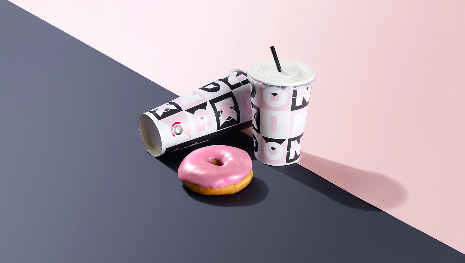
As a part of the Donut King rebrand and market repositioning, we were tasked with the challenge of improving their packaging design. Our solution was to develop a flexible and multifunctional pattern that could be used across a range of packaging mediums.
The goal was to create a range of packaging that would appeal to a predominately Millennial audience; Instagram worthy packaging that appeals to influencers.


Modular Patterns
& Pops of Pink
Strawberry Milkshake Pink, Soft-Pebble Grey and Deep Charcoal Grey feature heavily in the new Donut King store design and branding with minimal pops of Pink Icing Fuchsia. Incorporating this into the packaging design was essential. The pattern facilitates an even distribution of colour to remain on brand.
A modular approach to the pattern's structure allows Donut King to use the pattern successfully on any medium. It can be re-arranged and shuffled in any order to ensure the best appearance.


 6/9 Rothcote Court
 Appointments essential


